High Contrast Accessibility Toggle
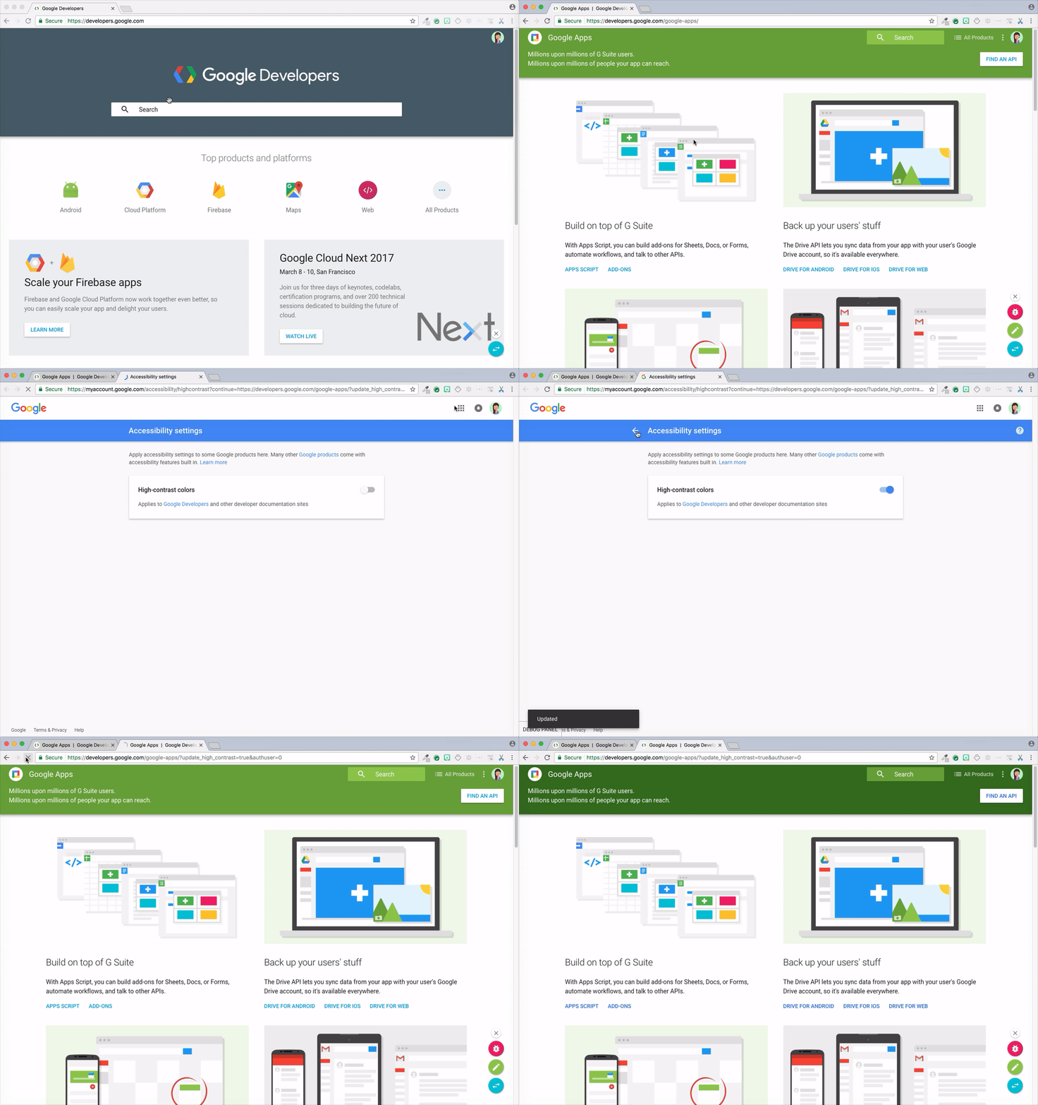
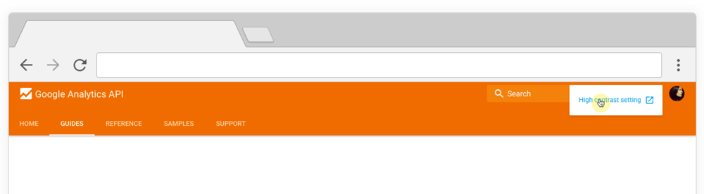
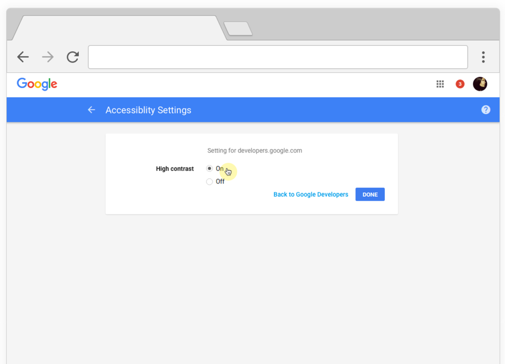
Creating universally accessible and structured documentation with well thought out UX is important to me. For our developer sites, we wanted to comply but without compromising the visual aesthetic of the site. We knew code colors could be particularly challenging – being able to decipher the differences between the code types was just as important as accessibility.
To solve this problem I proactively reached out and met with the accessibility and account central teams. I learned that we could use a 'high contrast' setting by creating color alternatives that were 100% accessible. This allows us to comply and directly impact users needing the extra boost of contrast. I tested each failing color and created a doc for the alternative values. We were the first team to reach out for this request and to get the ball rolling, I emailed the larger UX team to gauge the need across other products. As a result from my efforts, we were the first site to launch with this feature.
Directors: Adrien Pritchard :)
2016–2017
2016–2017