Google Developers Website: Marketing Revise
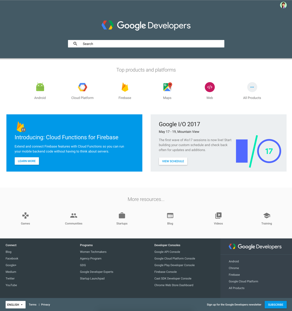
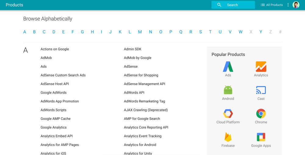
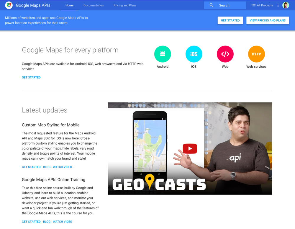
While defining the best path forward for Firebase's website UX, we identified opportunities to improve the rest of our central site, Google Developers (internally known as DevSite). This would also allow for engineering economy since we would share the code between the two properties.
In addition to these marketing upgrades, research following DevSite’s Material redesign last year found that ‘Google Developers’ as a brand wasn’t as recognized as the individual products. For example, ‘Maps API’ had more impact to a developer than referring to a ‘Google Developer Maps page’. These findings resulted in an overall rebranding.
Summary of my key contributions:
• Improved marketing navigation which came highly requested from our large product families; Maps and Apps by adding a top layer of tabs.
• Participated in multiple difficult branding discussions (there was internal attachment to the brand), user research, and mock iterations for the rebrand of Google Developers.
• Rebranded DevSite by making the individual products the hero in the site header and de-emphasize the Google Developer brand by putting it in the footer.
• Introduced a universal footer to provide a path to discovery to other Google offerings.
• Added a product directory link in DevSite’s header for easy cross-PA discovery.
• Reduced workload for our content writers & contributors by making visual changes automatic and fit within our current structure.
• Solved the issue of having Cloud and Android developer documentation sites use inconsistent webpage templates by creating easy, aesthetically pleasing templates for Chekov.
• Save Google thousands of dollars in agency work where writers can now easily create a landing page on DevSite with 50 lines of code or less.
• Define structure and consistency by creating a Chekov styleguide & best-practices for landing pages.
• Shortened the site header 60% from user and internal feedback by moving breadcrumbs in the content area, and product title into the header.
• Visually aligned the left navigation with the Firebase console.
• Updated the responsive behavior to use the hamburger as the top level navigation.
Developer research feedback from heuristic evaluation(external):
• "The site trains the users to use elements such as tabs, breadcrumbs, left nav and page TOC." - Yun
• “Sticky header is very useful for orientation and navigation.” - Mark
Directors: Jason Titus
2016
In addition to these marketing upgrades, research following DevSite’s Material redesign last year found that ‘Google Developers’ as a brand wasn’t as recognized as the individual products. For example, ‘Maps API’ had more impact to a developer than referring to a ‘Google Developer Maps page’. These findings resulted in an overall rebranding.
Summary of my key contributions:
• Improved marketing navigation which came highly requested from our large product families; Maps and Apps by adding a top layer of tabs.
• Participated in multiple difficult branding discussions (there was internal attachment to the brand), user research, and mock iterations for the rebrand of Google Developers.
• Rebranded DevSite by making the individual products the hero in the site header and de-emphasize the Google Developer brand by putting it in the footer.
• Introduced a universal footer to provide a path to discovery to other Google offerings.
• Added a product directory link in DevSite’s header for easy cross-PA discovery.
• Reduced workload for our content writers & contributors by making visual changes automatic and fit within our current structure.
• Solved the issue of having Cloud and Android developer documentation sites use inconsistent webpage templates by creating easy, aesthetically pleasing templates for Chekov.
• Save Google thousands of dollars in agency work where writers can now easily create a landing page on DevSite with 50 lines of code or less.
• Define structure and consistency by creating a Chekov styleguide & best-practices for landing pages.
• Shortened the site header 60% from user and internal feedback by moving breadcrumbs in the content area, and product title into the header.
• Visually aligned the left navigation with the Firebase console.
• Updated the responsive behavior to use the hamburger as the top level navigation.
Developer research feedback from heuristic evaluation(external):
• "The site trains the users to use elements such as tabs, breadcrumbs, left nav and page TOC." - Yun
• “Sticky header is very useful for orientation and navigation.” - Mark
Directors: Jason Titus
2016